
Syllabus Detail
- Structure Charts using Yourdon and Constantine method, 12 ATAR
Background
- Visual analysis of a program helps understand how that program works.
- A structure shows movement of data between modules in a program.
- It is very useful when the developer is talking to the client as a tool to help explain how the program will work.
Structure or design
- Rectangles are drawn and joined by lines.
- The top rectangle is often called the 'main' module.
- The rectangles under this are other modules or sub-routines.
- These other modules or sub-routines get data from the 'main' module and sometimes return data to it.
- These data flows look a bit odd, they have a small circle at the end of an arrow.
- A white circle is data coupling (data shared by a couple of items/modules)
- A black circle is control coupling (returns a boolean value indicating control). eg Has check been printed = True. Therefore it is a control couple.
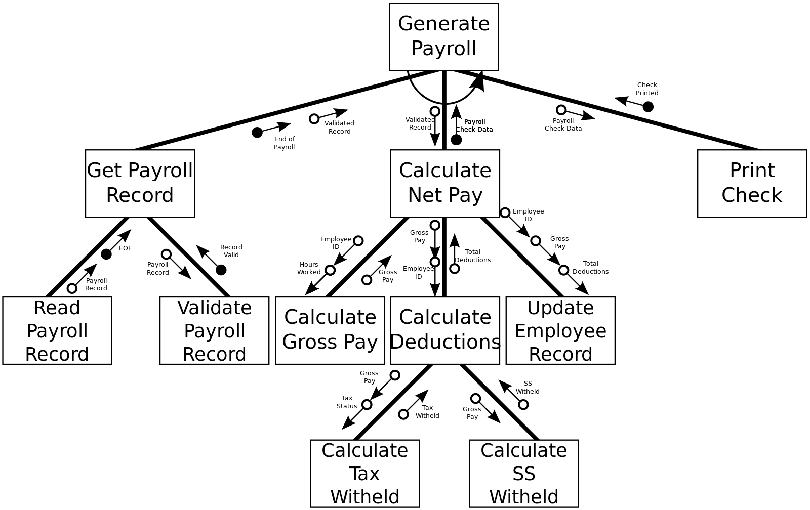
Image reference: https://en.wikipedia.org/wiki/Structure_chart
Further Research
- Youtube movie that is worth having a look at. Thank you to... Christopher Kalodikis. Published on May 14, 2017
Worksheet and Practice (yet to be added)
Found an error or have an enhancement? Please let us know via this contact form