- Details
- Category: Design Concepts
- Hits: 6073

The elements of design appear on your design. ie They are on the paper (or screen).
A line is an element.
- be any size or thickness
- be any shape
- be spiralled
- be curved or jagged
- be a dotted line
- be arrowed
- be textured
- be patterned
- go in any direction
- create movement
- organise information - like in a table
- can connect - text to a image, like labelling parts in a diagram
- separate - columns
- provide a frame - box around a an image
- provide emphasis - around or near text
Meanings can be attached to lines
- straight lines = structured, controlled
- horizontal lines = rest, relaxed, calm, quiet, peace
- vertical lines = accentuate height, dignity, alertness
- thin lines = fragile or easy to break
- thick lines = strength, bold
- diagonal lines = unbalanced, restlessness, dramatic, action
- curved lines = flowing, graceful, calm small curve, dynamic large curve
- zigzag lines = high energy and excitement
- parallel lines same width = orderly effect
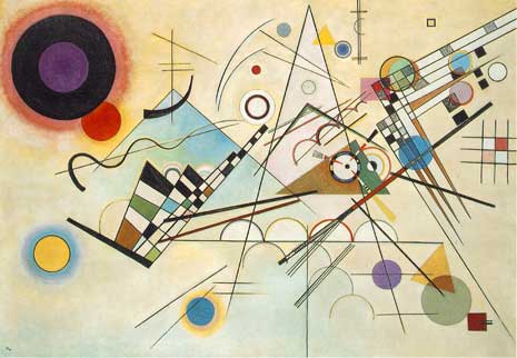
A shape is an element.
- shape = closed line surrounds an area
- shape = can see it with colour, texture or value
- shape = defined boundary
- 2 types = free form and/or geometric
- geometric = describe mathematically, very regular, often found in man-made things
- free-form = difficult to describe, often irregular, often found in nature
- all objects have shape = line is a very long narrow shape
- positive shape = positive space, the background is the negative space (blue in image below)
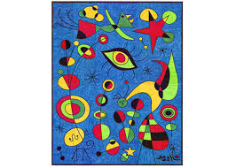 Miro
Miro
Meanings can be attached to shapes
- shapes can organise
- add interest
- sustain interest
- direct the eye
Learn more here,
Space is an element.
- space = the area around things
- How much space do you put between things?
- white space = empty
- positive space = space object uses
- negative space = space around object
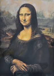 Mona Lisa
Meanings can be attached to space
- white space gives the eye a rest, is peaceful
- tie elements together = little space
- highlight an object = lots of white space around it
- unequal space = dynamic (more happening)
- create depth = overlap objects ie less space given
Learn more here,
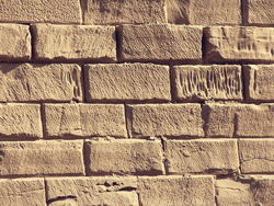
Texture is an element.
- is the surface
- touch it , see it, taste it = 3D texture
- food has texture, soft, crisp, creamy, crunchy
- real texture = we can feel it
- digital design is pretend texture by colour, tone or line = 2D texture
- often includes repeating an element or pattern
- smooth, rough, slimy, prickly, soft, hard, spiky, velvety
- texture = visual interest
Meanings can be attached to texture
- links to memory of that material
- timber = rough
- glass and metal = cool, calm
- soft texture like cushions = warm
- prickly = danger
Colour is an element.
- is produced as a result of light
- colour on a monitor = Red, Green, Blue (RGB)
- monitor colour measured as a value up to 255
- monitor green = 0,255,0
- monitor red = 255,0,0
- monitor white = 255,255,255
- colour for printing presses = Cyan,Magenta,Yellow,blacK (CMYK)
- CMYK is measured in % of each colour eg cyan = (100, 0, 0, 0)
- Hue = common name for a colour
- Shade = hue + black
- Tint = hue + white
- intensity = brightness of the colour (Saturation)
- value = lightness and darkness of the colour
- primary colours = red, yellow and blue
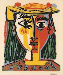 Picasso
Meanings can be attached to colour
- red, orange and yellow = warm colours
- blue, green and purple = cool colours
- bright colours = loud, action, exciting
- pale colours = peace, quiet, calm
- harmonious colours = peace and calm
- red = anger, passion
- white or blue = cleanliness, purity
- black for some cultures = death
- warm colours = closer
- cool colours = further away
- can be used as a symbol for words or numbers, eg a legend
- can create visual effects, patterns
Learn more here
Learn more about Design from other websites here 1, 2, 3,
*3D Form is an element.
- measured side to side, top to bottom and back to front (3 dimensions)
- 3D form in art = sculpture
- digital design is pretend 3D form
- 3D form on paper or on a screen = fake 3D form (2D form)
- fake it with overlapping, size larger = closer, light or dark colours
- fake it with lower position = closer, more details = closer
- often includes repeating an element or pattern
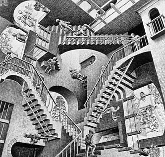 Escher
Meanings can be attached to 3D forms
- used to enhance visual
- create realism
Learn more here
*Tone is an element.
- dark / light
- no light = dark tones
- no dark = light tones
- create contrast with very light against very dark tones.
- gradation is changing dark tones to light tones in steps
- dense and sparse elements can create tone
- make new tones by adding white or black
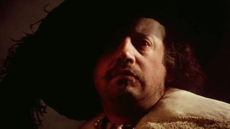 Rembrandt
Meanings can be attached to tone
- tone can be used to represent quantity. eg colour on a weather map, rain chart
- tone can assist drawing 3D objects (3D form)
- dark tones = evil, gloom, more weight
- light tones = innocence, open space
- contrasting tones = dramatic effects, visual effects
- tone = readable or unreadable text
Learn more here
- Details
- Category: Design Concepts
- Hits: 12482
User Rating: 5 / 5

SYLLABUS
- features of a user interface 12 ATAR
VOCABULARY
- user interface (UI) = is the way humans interact or engage with a computing device, handheld, laptop or desktop
- device interface = every computing device has an interface that people use in order to 'work' the device
- interaction with the device could be clicking a mouse, sliding a finger across a screen, talking to or listening to the device
- usability = how easy it is to use
- inclusivity = a sense of belonging, can participate. Include community, culture as well as
- accessibility = "To allow people with and without disabilities to benefit from the same services" source
DETAILS
- UI includes input controls; buttons, text input boxes, radio buttons, check boxes, drop down lists
- UI includes navigation controls; breadcrumbs, sliders, search fields
- UI includes information components; tool tips, progress bar, message box
Graphical user interface (GUI) suitable for target audience
- if a target audience is 5 years old, large pics, not much text, bright colours
- if a target audience is 55 years old, small pics, text, normal colours
- match the interface to the users (target audience)
Logical and hierarchical organisation of content
- UI should be well set out, not cluttered, easy to follow, large sites should have a sitemap for hierarchical organisation
- UI should have a flow that is easy to understand. Small sites should have a menu system that is named using common names (logical organisation, eg About Us, Contact Us, Home etc
- Let things go where they are expected to go.
Relevant help features of a graphical user interface
- usability; people will be able to use the website more effectively with the following;
- a search function
- a site map
- breadcrumbs
- inclusivity;
- language choice,
- cultural sensitivity (images in one culture may not be liked in another culture),
- gender neutral or specific
- accessibility;
- font resizeable,
- alternate text for images,
- screen readers (software that vision impaired people buy to be able to 'read' the screen)
- choose colour blind friendly colours (not red and green together)
FOR YOU TO DO
- Name and describe 3 functions on a website that help with usability.
- Name and describe 3 functions on a website that help with inclusivity.
- Name and describe 4 functions on a website that help with accessibility.
- Write a short paragraph explaining the difference between usability, inclusivity and accessibility.
Learn more from PC Magazine, boogdesign (good site), perspectives, W3C,
Found an error or enhancement? Please use the contact form under the Home menu item.
- Details
- Category: Design Concepts
- Hits: 6079
Syllabus
- Identify and explain the elements of design and the principles of design in an existing digital product or solution.
Overview
- a major part of graphic design is understanding why the designer placed what onto the graphic
- this page gives some examples of design analysis as models for you to learn from
- it uses ideas from Design Elements and Design Principles on this website
- Design principles are the thinking behind putting the design elements on the page or screen
- for the analysis, use two or three main principles and elements that are obvious, then finish off with several smaller influences
Important phrases to use
- the element of X is evident in this graphic... , is presented in this graphic... , is highlighted by...,
- eg The element of colour is evident in this graphic by the ...
- the principle of Y is portrayed by using the element of X
- eg The principle of dominance is demonstrated in this graphic by using a very large diamond shape in the foreground...
Graphical Analysis 1
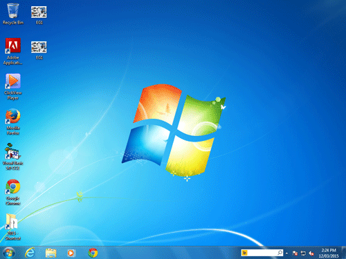
Source: Microsoft Win7 Desktop
Planning
Dominance; rectangles, white light focuses on flag, curved lines = movement, colour dark blue unimportant, white glow lower left, white line carries eye to Start Button, refreshing colour blue/white.
Writing
The principle of dominance is evident in this graphic. The four rectangular shapes (elements) are quite large and dominate the centre of this image. The small negative space between the rectangles ties the rectangles together. The element of colour also ties these rectangles together. The white colour gives the illusion of a bright white spotlight in the middle of the rectangles. It is not surprising that this rectangle is the focus for this image, given that it appears to be the Windows flag. The principle of movement is also demonstrated in this graphic as the Windows flag appears to be moving. The element of curved lines has been used in the rectangles in such a way as to copy the way that a flag would fly in the wind.
The use of white again in the bottom left corner, and the white lines pointing to the bottom left corner attract the eye to the bottom left which is where the clients are supposed to focus. Realising that the purpose of this graphic is to be a desktop for a computer, the clients are attracted to this corner where they can find the start menu. This is confirmed with the duller and darker blue colour around the right and upper edges leading to the less important part of the graphic. The colours of blue and white are refreshing and cool which happens to be the desired goal of a new operating system.
Graphical Analysis 2
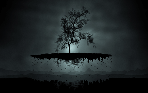
Writing
The above image has the main design element of tone sprinkled throughout. Tone provides the illusion of depth giving a false 3D image of a tree floating in front of the moon. It appears to be a moon because light tones in a circular pattern are what we see in the sky. The black dots under the long oval shape give the appearance of dirt falling which makes us think that the tree is floating. The dark tones under the long oval shape give. The lightest tones in the centre of the image give us a focal point where the graphic designer wants us to look. Inversely, the darker tones on the outside gain little of our attention.
For you to do
- Apply this knowledge, and then practice it so that you can analyse images in preparation for your exam.
Editor Note: More analyse practice to be added here.
Found an error or enhancement? Please fill out this contact us form.