

Syllabus
- Identify and explain the elements of design and the principles of design in an existing digital product or solution.
Overview
- a major part of graphic design is understanding why the designer placed what onto the graphic
- this page gives some examples of design analysis as models for you to learn from
- it uses ideas from Design Elements and Design Principles on this website
- Design principles are the thinking behind putting the design elements on the page or screen
- for the analysis, use two or three main principles and elements that are obvious, then finish off with several smaller influences
Important phrases to use
- the element of X is evident in this graphic... , is presented in this graphic... , is highlighted by...,
- eg The element of colour is evident in this graphic by the ...
- the principle of Y is portrayed by using the element of X
- eg The principle of dominance is demonstrated in this graphic by using a very large diamond shape in the foreground...
Graphical Analysis 1
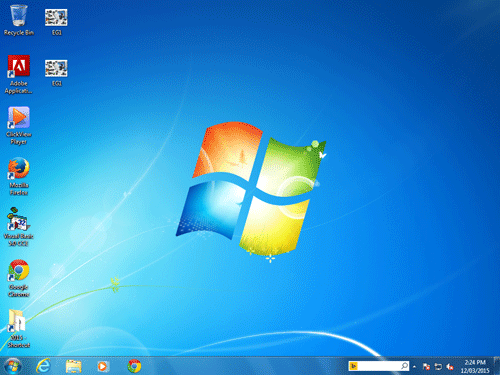
Source: Microsoft Win7 Desktop
Planning
Dominance; rectangles, white light focuses on flag, curved lines = movement, colour dark blue unimportant, white glow lower left, white line carries eye to Start Button, refreshing colour blue/white.
Writing
The principle of dominance is evident in this graphic. The four rectangular shapes (elements) are quite large and dominate the centre of this image. The small negative space between the rectangles ties the rectangles together. The element of colour also ties these rectangles together. The white colour gives the illusion of a bright white spotlight in the middle of the rectangles. It is not surprising that this rectangle is the focus for this image, given that it appears to be the Windows flag. The principle of movement is also demonstrated in this graphic as the Windows flag appears to be moving. The element of curved lines has been used in the rectangles in such a way as to copy the way that a flag would fly in the wind.
The use of white again in the bottom left corner, and the white lines pointing to the bottom left corner attract the eye to the bottom left which is where the clients are supposed to focus. Realising that the purpose of this graphic is to be a desktop for a computer, the clients are attracted to this corner where they can find the start menu. This is confirmed with the duller and darker blue colour around the right and upper edges leading to the less important part of the graphic. The colours of blue and white are refreshing and cool which happens to be the desired goal of a new operating system.
Graphical Analysis 2

Writing
The above image has the main design element of tone sprinkled throughout. Tone provides the illusion of depth giving a false 3D image of a tree floating in front of the moon. It appears to be a moon because light tones in a circular pattern are what we see in the sky. The black dots under the long oval shape give the appearance of dirt falling which makes us think that the tree is floating. The dark tones under the long oval shape give. The lightest tones in the centre of the image give us a focal point where the graphic designer wants us to look. Inversely, the darker tones on the outside gain little of our attention.
For you to do
- Apply this knowledge, and then practice it so that you can analyse images in preparation for your exam.
Editor Note: More analyse practice to be added here.
Found an error or enhancement? Please fill out this contact us form.