
SYLLABUS
- typeface; size, alignment, format, spacing 11 GEN, 11 ATAR
VOCABULARY
- typeface = a design for a set of characters
- size = how large or small
- alignment = arrangement in a line; left, right or both
- format = the way that it is arranged or set out
- spacing = the distance between
- typography = the art of arranging type
- glyph = one character in a font set
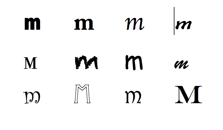
The image below shows glyphs for the letter m
DETAILS
- use only one or two fonts in your digital solutions
- typeface (or font) have several characteristics including the way they look
- serif or sans serif; the last m above has serif (or decorarive marks) remember that sans means no, so sans serif means no decorative marks
- serif is supposed to be easier to read on paper, sans serif easier on screen; do your own analysis on this; What do you think?
- the weight of line used - bold or naturally heavier within a typeface (or font set)
- uppercase / lowercase; most fonts come in uppercase and lowercase. Which ones don't?
Size
- the size - how big
- size for fonts, measured in 'points' 72pt is 1" or 2.5cm in height
- size is standardised across all applications
- a size 16 pt font in Micrsosoft Word is similar in size to size 16 in Apple's Pages
Alignment
- alignment; left align = text lines are rendered flush left, centre = text lines are centered, right align = text lines are rendered flush right
Format (TBC)
- bold, italics, underlined
Spacing
- Tracking is the equal space between all the letters in a word, eg w o r d or larger spacing w o r d
- Kerning is the uneven spaces between some letters in a word. The letters r and n when together like this, rn , actually look like an m
- You can change the kerning in some software to automatically fix problem letter combinations
- http://www.w3schools.com/cssref/css_websafe_fonts.asp Here you can experiment with what a font will look like from your code input. Click the green box, Try Yourself
FOR YOU TO DO
- Make a document with 1 page that displays the most wide ranging fonts you can find. Only have 12 words at size 36 points.
- Make a second document with the most unusual fonts you can find on the internet.
- Make a third document with images of bad kerning and other poor examples of font used in advertising
- Save these documents in your typography folder
Learn more from creative blog and font rendering at Smash Magazine
http://www.smashingmagazine.com/2012/04/24/a-closer-look-at-font-rendering/
Found an error or enhancement? Please use the contact form under the Home menu item.