

Syllabus
The concept of responsive design; 11 ATAR
Background
Digital technologies have changed the way that people use computing devices. In the past computing was always on desktop computers. These days, mobile devices nearly outnumber desktop devices. As a result web designers need to change websites so they can show correctly on mobile devices.
What is responsive design?
- Responsive design is creating a website that can be viewed on a desktop computer, smartphone or tablet.
- It automatically changes the menu structure to suit the device you are on.
- It should have minimum resizing by the user.
- It uses fluid, proportion based grids. eg % of screen, instead of 1080 pixels.
- It uses flexible image sizes based on relative size.
- Google have started boosting ratings for sites that are mobile friendly.
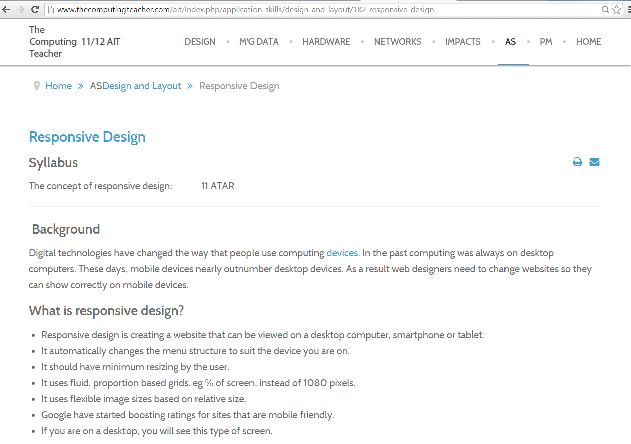
- If you are on a desktop, you will see this type of screen.
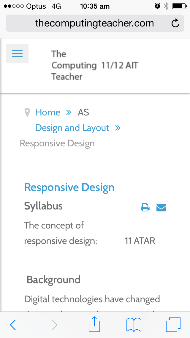
- If you are on a mobile device, you will see this type of screen.
How do you make a responsive design website?
- The easiest way is to select a responsive design template from you web making software.
- Then make your website as normal.
- The CSS template will automatically change your website to suit the device it is being viewed on.
FOR YOU TO DO
1. What is responsive design?
2. Why do we use it?
3. How do we make a website using responsive design?
Learn more from wikipediaFound an error or enhancement? Please fill out this contact us form.