
The principles of design are the thinking behind what you put on the paper
Balance is a principle of design.
- all things equal in the design
- symmetrical balance = same on both sides
- symmetrical balance = like a mirror image
- asymmetrical balance = equal on both sides but not the same elements
- off balance = not balanced placement of elements
- create symmetrical balance = repeat left side on the right side
- create asymmetrical balance = repeat left side on the right side, but with different element
- formal balance = place images side by side
- informal balance = place images similar but imbalanced
- horizontal balance = from a central horizontal line
- vertical balance = from a central vertical line.
- radial balance = similar coming out from the centre
Meanings can be attached to balance
- balanced = comfortable, formal, ordered, quiet
- informal balance is more dynamic
- informal balance = gains a focus on visual message
Emphasis (contrast) is a principle of design.
- happens when two elements are different
- greater the difference = greater contrast
- different colour, value, size and type
- opposites such as colour, light/dark, direction up/down

Meanings can be attached to emphasis by contrast
- used to emphasise
- used to highlight
- used to catch your eye
- adds interest
- shows what is important
- can be too much if you overdo it
Learn more here at google site (has a quiz too)
Emphasis (proportion) is a principle of design.
- the relationship of 2 or more objects
- is how 2 or more objects (elements) compare
- size and scale
- purposeful distribution of objects
- to maintain proportion, use it once, use it two more times
- thickness of lines should be in proportion to text
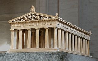 Greek temples were designed and constructed according to set proportions, mostly determined by the lower diameter of the columns. (wikipedia)
Meanings can be attached to emphasis by proportion
- distort size = objects closer to front
- choose object size for the effect the want
- good proportion adds harmony
- if all elements similar = good proportion
- use to demonstrate a size difference
- build a focal point
- prominent shapes attract attention
Learn more here at Visscom wordpress
Dominance is a principle of design.
- some elements more important
- one is overpowering the other
- visual weight of the element
- the one that stands out
- dominant = one in foreground with most visual weight
- sub-dominant = the secondary object
- subordinate object = little visual weight, background
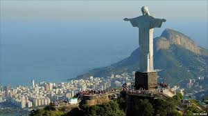 Christ the Redeemer has dominated Rio de Janeiro skyline for 80 years
Meanings can be attached to dominance
- is the focal point
- the centre of interest
- point of importance
-
Learn more here
Unity (proximity) is a principle of design.
- is how close objects are together or visually connected somehow
- if close = good unity
- see objects as one group
- arrange as a group
Meanings can be attached to unity by proximity
- a sense of oneness
- helps unify a design
- keep a caption close to its image
- keep contact address/telephone/email details together, easy to see it
- use sub-groups as needed, eg website put tabs together
Learn more hereat nwrain.net
Unity (repetition) is a principle of design.
- by using similar shapes
- by using similar patterns, line, shape, colour, value, texture
- by using a common background
- all elements function as one
Meanings can be attached to unity by repetition
- a sense of oneness
- helps unify a design
- a feeling of organised movement
Learn more here at visual literacy,
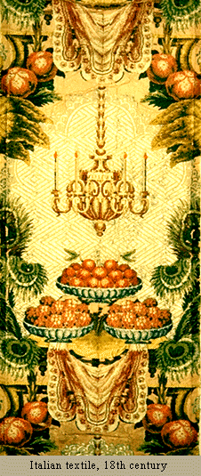
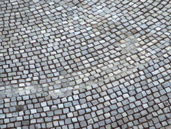
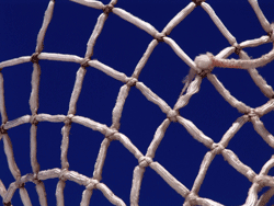
Pattern is a principle of design.
- planned or random repetitions
- rich surface design
- repetition of elements such as lines, colour, values, textures
- often has centre of interest
Meanings can be attached to pattern
- often has centre of interest
- increases visual excitement
Learn more here at google site
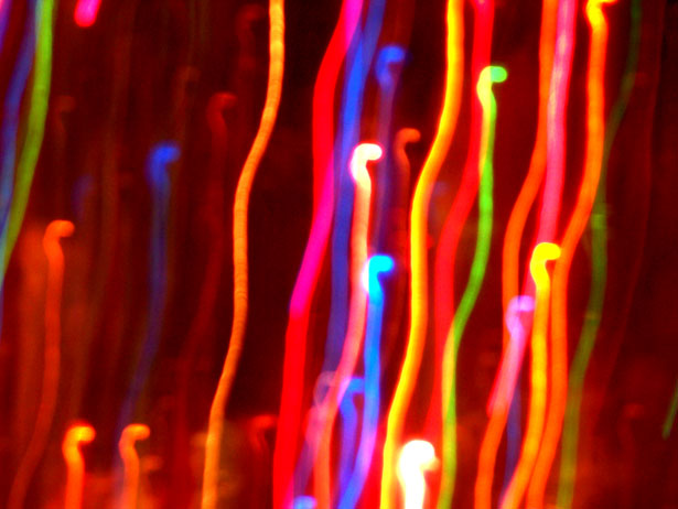
Movement is a principle of design.
- movement in still images is an illusion
- trick the human eye to think an object is moving
- linked to rhythm
- linked to flow
- is the path your eye takes looking at a design
- your eyes can be directed along lines, colour, edges and shapes
- artists lead your eye through the design
 from Public Domain Pictures
Meanings can be attached to movement
- diagonal lines create an illusion of movement
- blurr = movement if used effectively
- text directs eye movement. left to right, top to bottom
- change of colour value creates movement
Learn more hereat google site